Once a question has an image or video attached, the Layout row in the right panel decides where it sits: as a background, beside the text, filling half the screen, or as a banner. The canvas previews each option live.
The Layout row
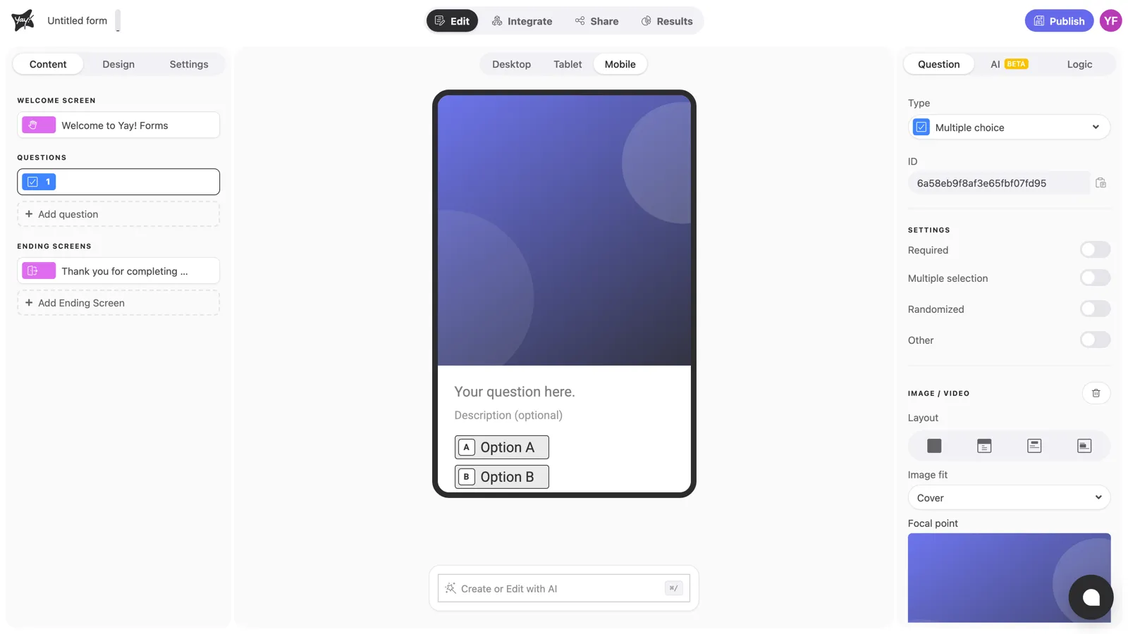
With the question selected, find Layout under Image / Video in the right panel. It’s a row of icons, one per layout. Click one to apply it.
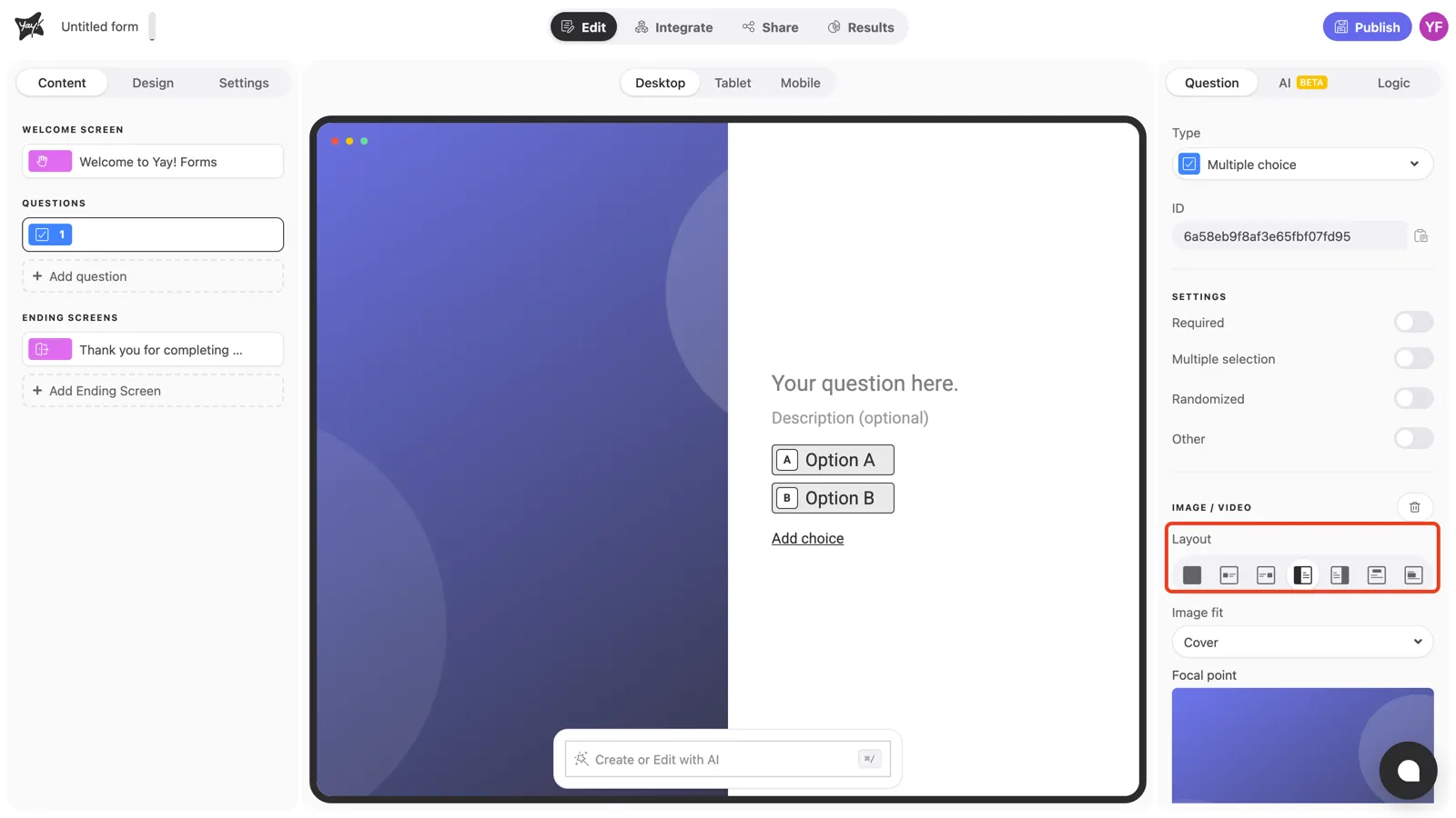
The seven desktop layouts
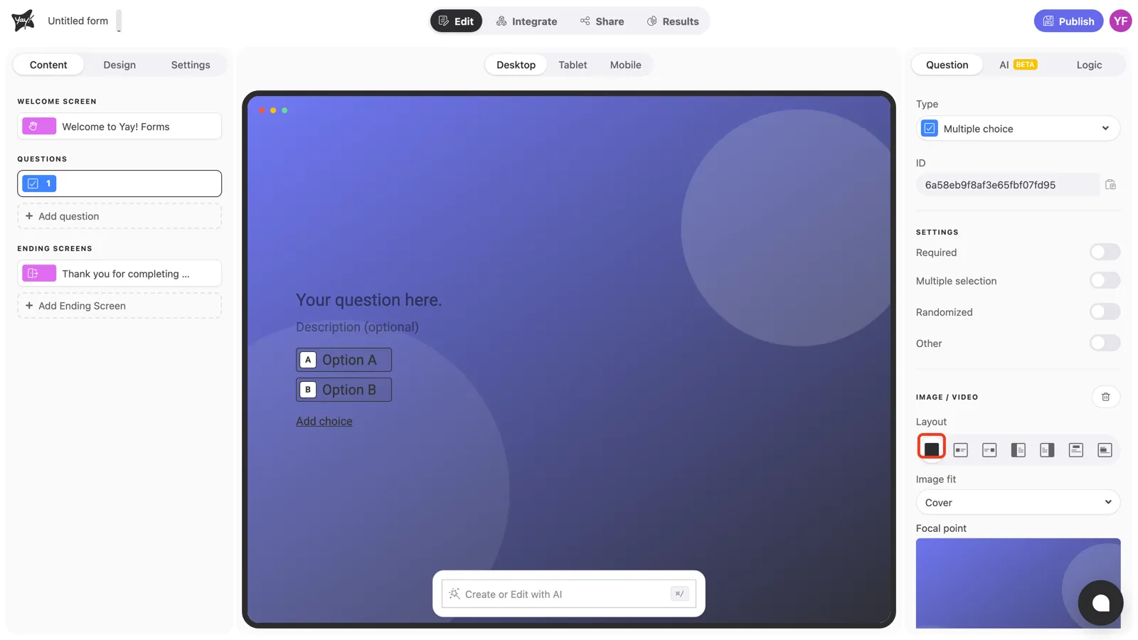
1. Background. The image fills the entire screen behind the question. Great for atmosphere; make sure the text stays readable over it.
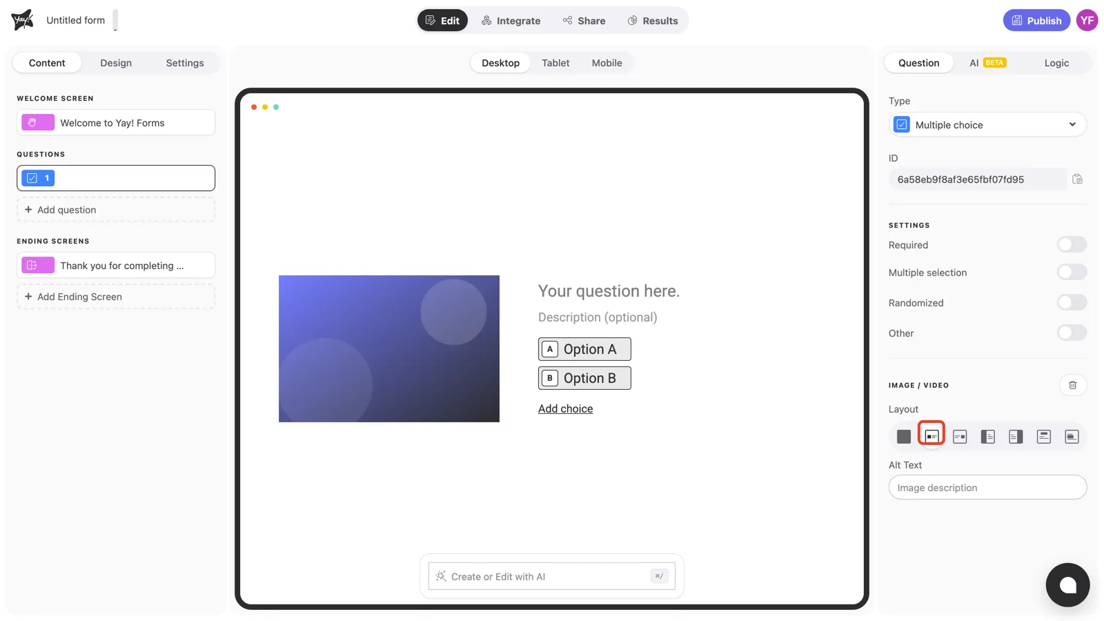
2. Left of the text. The image sits in a box beside the question, on the left.
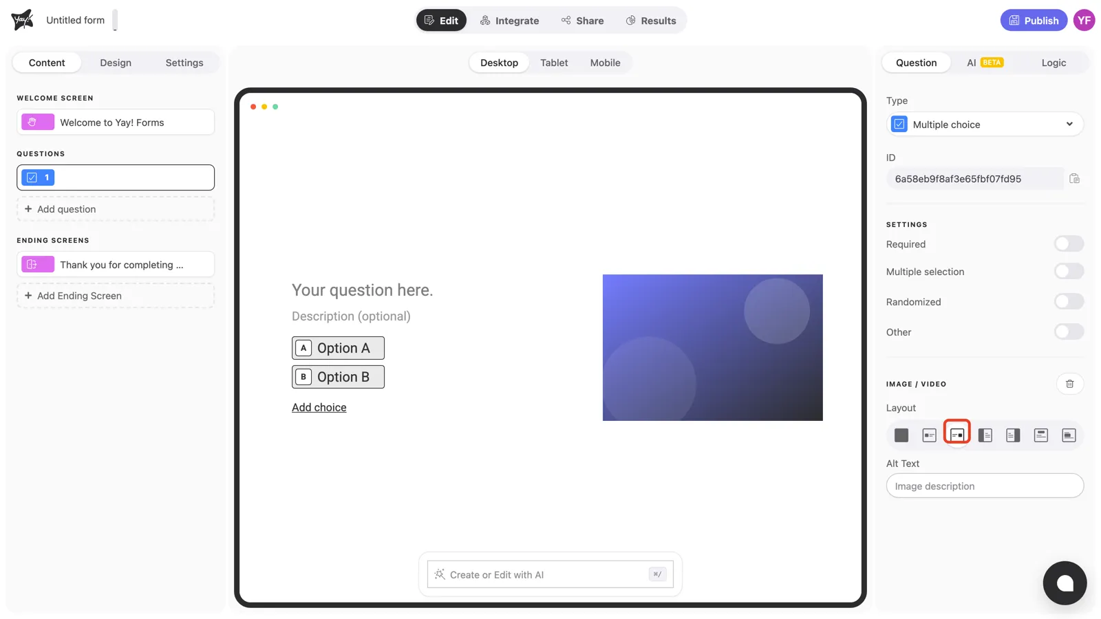
3. Right of the text. The mirror of the previous one.
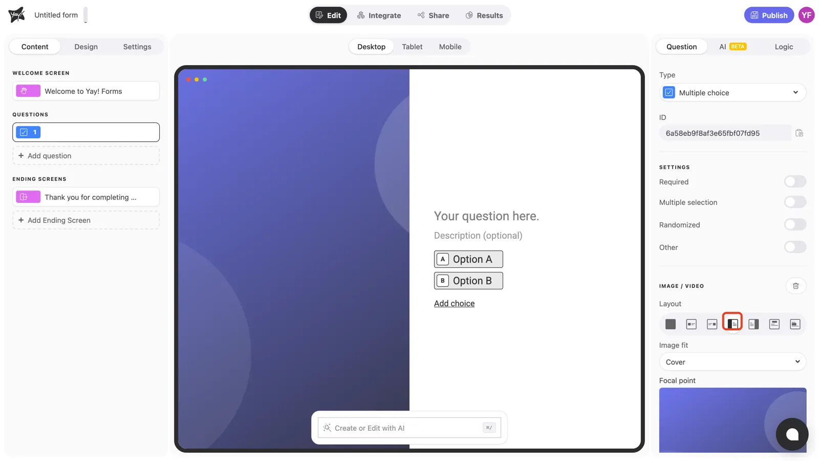
4. Split left. The image fills the left half of the screen edge to edge; the question takes the right half. The classic look for product photos and portraits.
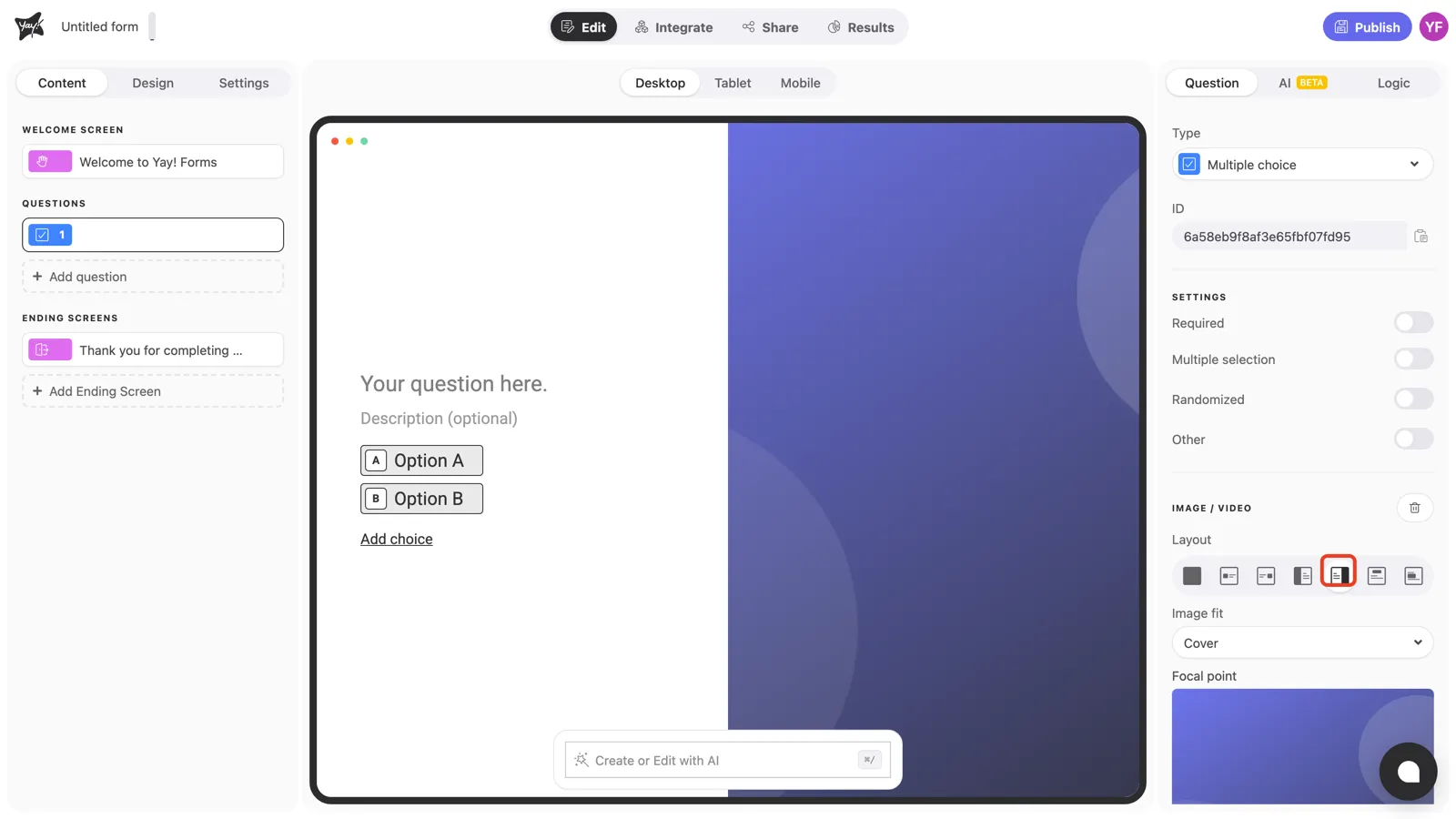
5. Split right. Same split, image on the right.
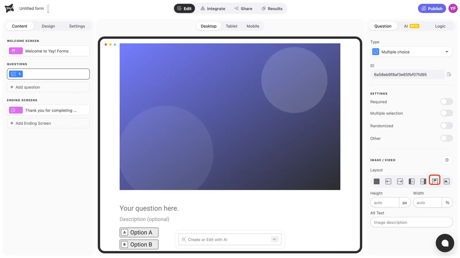
6. Above the question. The image renders as a banner on top of the question, the natural spot for a logo. This layout (and the next) also unlocks Height and Width fields to fine-tune the size.
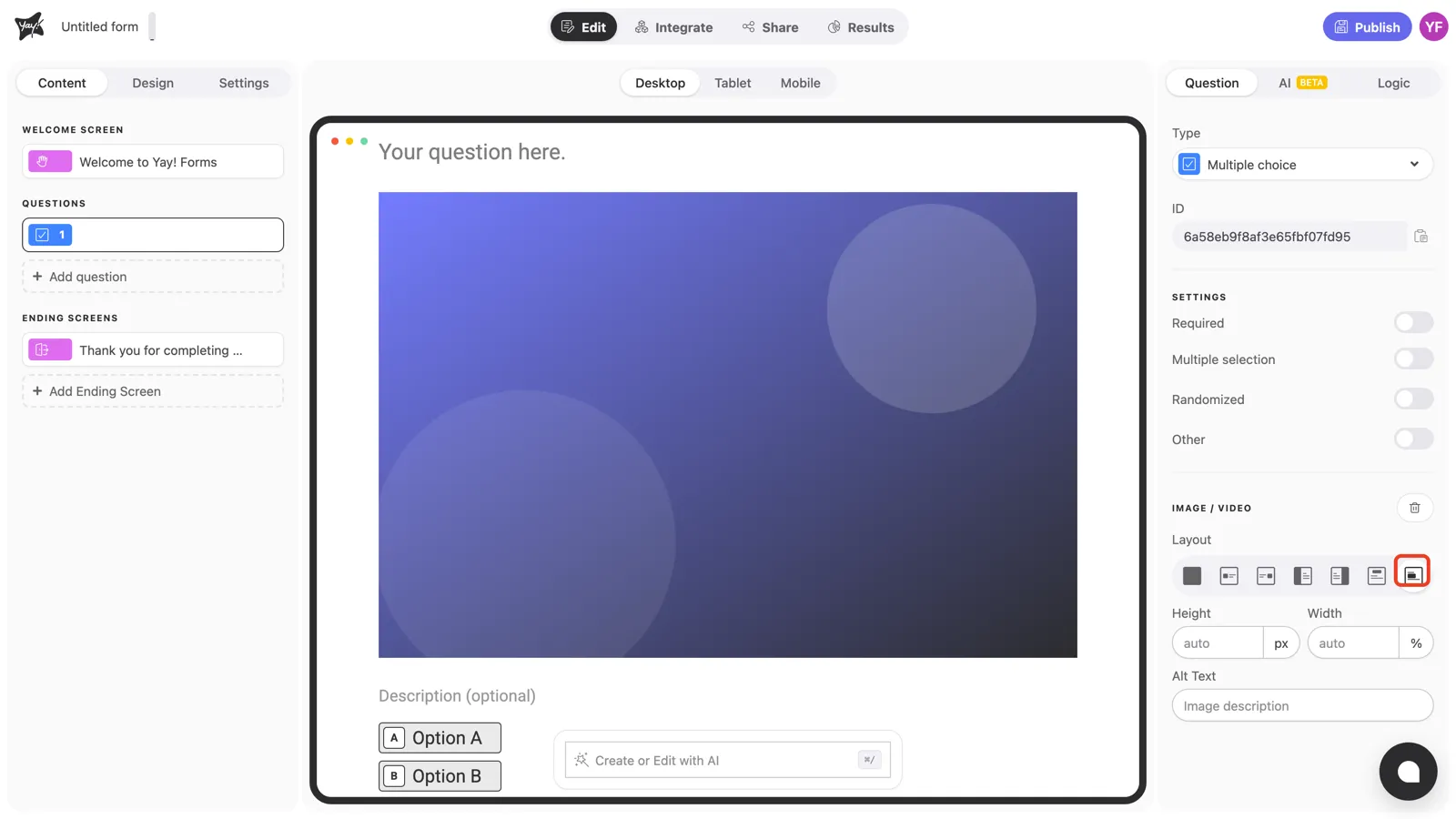
7. Below the question. The image appears right after the question title, before the choices. Use it when the question is about the image (“Which of these designs do you prefer?”).
On mobile
Phones don’t have room for side-by-side layouts, so the Mobile view offers a compact set of four, including Split top, which stacks the image above the question. Use the device switcher above the canvas to preview and adjust each device separately; see How to customize the form layout per device.
Conclusion
You’ve learned the seven desktop image layouts (background, floated, split, and banners), which ones unlock size or focal-point controls, and how the set adapts on mobile.
Related articles: